What is a KPI dashboard? | No-nonsense guide with examples
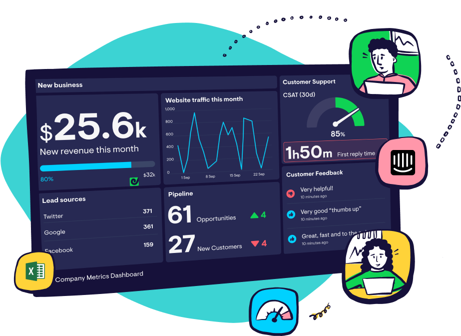
A KPI dashboard is a visual display of metrics and other information that helps you monitor your business performance at a glance....
Subscribe to our monthly newsletter for business leaders who want to get smarter with data, dashboards and KPIs.
Geckoboard is the easiest way to make key information visible for your team.
Learn how